Improving the rental service

I improved the booking experience by prioritising clarity, simplicity and user control. Car comparisons are now easier with upfront pricing, the add-ons flow is clearer and more intuitive, and a step-by-step process with progress tracking keeps users on track.

COMPANY

UX Institute

ROLE

UX Designer

Team

Just me

YEAR

2024

Problem

The booking process felt cluttered and confusing, especially during add-on selection, resulting in high drop-off rates. Users struggled to compare cars and complete checkout. I aimed to simplify the flow, improve clarity, and boost conversions.

Solution

I enhanced the booking experience by focusing on clarity, simplicity and user control. Car comparisons are now more intuitive with upfront pricing, and the add-ons flow is cleaner and easier to understand. A guided step-by-step process with a progress tracker keeps users on track throughout.

Defining the user problem

Research

To confirm my theories, I used benchmarking exercises and usability testing to identify best practices and improve the booking experience. Competitor analysis and user tests revealed key insights that guided design decisions and streamlined the process.

Click here for the user test.

Click Here for the benchmarking exercise

Issue: A couple of users were confused by hidden fees.

I'm unsure about the add-on costs—it feels expensive, but I don’t know why.” Observed Behaviour: Some users abandoned their booking when faced with unclear pricing.

Issues:Confusing add-ons

section

“God! I have no idea what that means! Observed Behaviour: Some users skipped add-ons entirely, while others hesitated, unsure if they were necessary.

A gap in the market

By improving clarity and cutting unnecessary jargon around bookings and add-ons, we give users a smoother experience than key competitors and address their concerns and hesitations during the booking process.

Research, Brainstorms, and Wireframes

Design factor to keep in mind

Research, Brainstorms, and Wireframes

Design factor to keep in mind

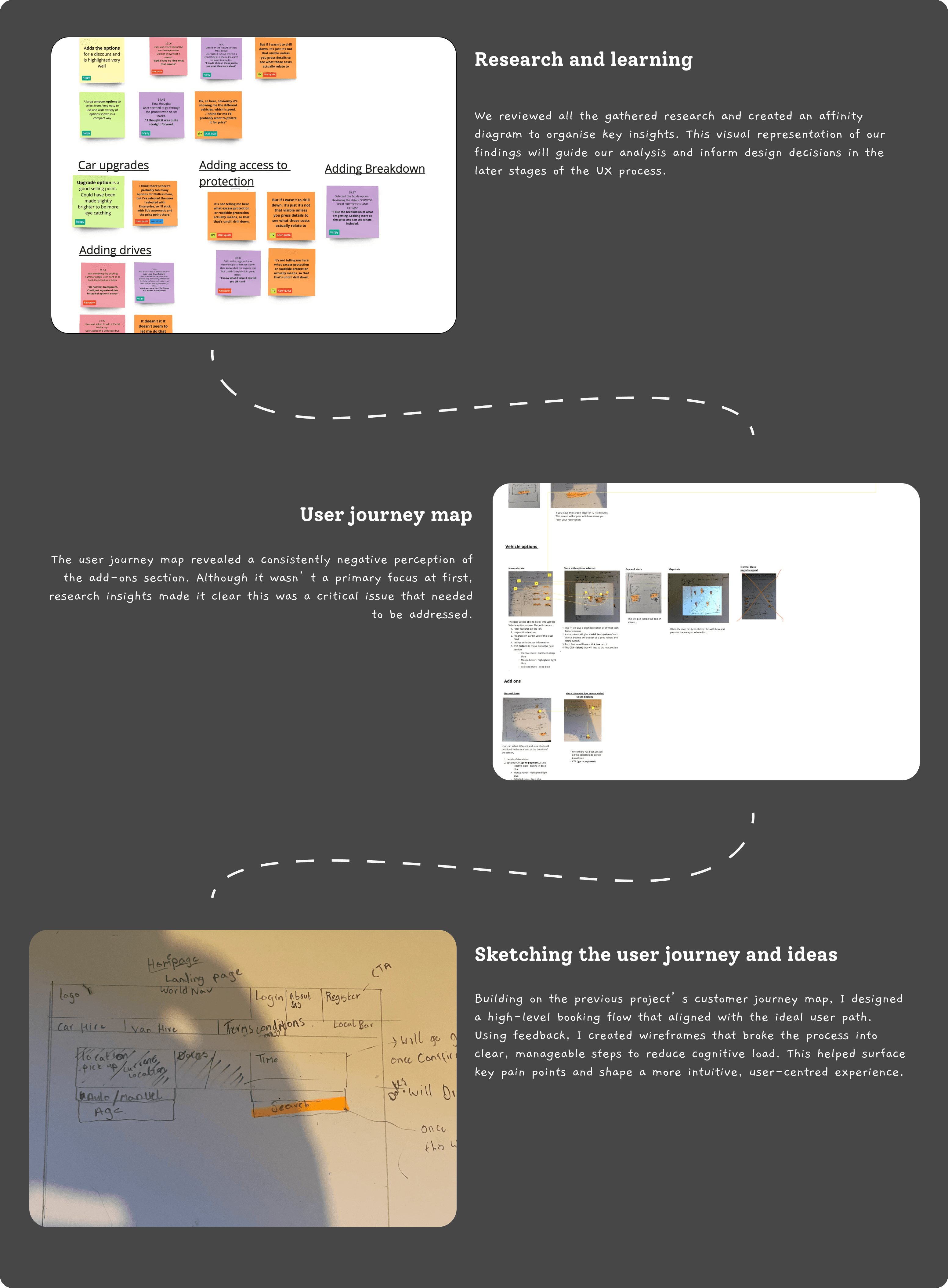
Overload and Clarity

Users don’t want to discover an unexpected £250 fee when collecting the vehicle. We should be more transparent with this information upfront.

Less is more

Some information is unnecessary. Remember, the user's goal is simply to hire a car and drive—nothing more.

Crafting the user experience

I moved into low-fidelity wireframing to shape the experience. The goal was to reduce unnecessary jargon and keep the add-ons flow as simple and straightforward as possible.

More to come soon!