Ruffle
Founded by Mark Wickstead, Ruffle is powered by a dedicated team of technologists, product specialists, and commerce enthusiasts. Together, we pool our expertise to craft a marketplace that balances the interests of both buyers and sellers. The website allows users to enter online competitions for a chance to win prizes, but usability issues were causing frustration and drop-offs.
Founded by Mark Wickstead, Ruffle is powered by a dedicated team of technologists, product specialists, and commerce enthusiasts. Together, we pool our expertise to craft a marketplace that balances the interests of both buyers and sellers. The website allows users to enter online competitions for a chance to win prizes, but usability issues were causing frustration and drop-offs.
Founded by Mark Wickstead, Ruffle is powered by a dedicated team of technologists, product specialists, and commerce enthusiasts. Together, we pool our expertise to craft a marketplace that balances the interests of both buyers and sellers. The website allows users to enter online competitions for a chance to win prizes, but usability issues were causing frustration and drop-offs.
Tools
Tools
Tools
Figma / miro
Founded
Founded
Founded
2024
Duration
Duration
one month
Role
Role
Role
Product designer
Challenge
Ruffle aims to create a marketplace where both buyers and sellers receive optimal value while fostering an inclusive, diverse community. My goal is to simplify the buying process from the buyers perspective.
The Solution
Users visiting the competition website struggled with unclear navigation, confusing entry steps, and a lack of transparency in pricing and rules. This led to frustration and drop-offs, reducing participation. Our goal was to streamline the process, making it seamless, engaging, and user-friendly.
Before & after
Login screen: Stright to the point but had very few options for to select from

The design layout becomes confusing from here. two of the same image is not needed at different sizes

The question is asked but can easily be by passed with the wrong the answer.

When pressing the Plus button, a -1 appears, which is a clear error and can be quite frustrating.

before
Inconsistent Aesthetics: Users were unsure if the design matched the Raffle website.
Confusing Ticket Purchase Process: Led to uncertainty and hesitation.
Users had trouble finding active competitions
Login screen: Straight to the point but had very few options to select from

After
Cohesive Branding: All elements now align seamlessly with the website, ensuring a unified and professional look.
Intuitive Visual Cues: Strategic design cues guide users effortlessly, enhancing transparency and ease of navigation.
Streamlined Ticket Purchase: A simplified process minimizes confusion and instills greater confidence in users during transactions.
The Research
Login screen: Stright to the point but had very few options for to select from
The design layout becomes confusing from here. two of the same image is not needed at different sizes
The question is asked but can easily be by passed with the wrong the answer.
When pressing the Plus button, a -1 appears, which is a clear error and can be quite frustrating.

User research
I conducted a few usability tests to uncover real-world user behaviours and pain points, ensuring the design met actual user needs. This involved an in-depth user test that provided valuable insights, guiding refinements to enhance the overall experience and improve decision-making.

My Review of the
product
I conducted a thorough product review to gain a deeper understanding of its functionality and user experience. Given Ruffle's unique position in the market, identifying direct competitors proved challenging. Credit to the developers for creating an innovative solution unlike anything currently available.
Reviewing the process and product
I conducted a thorough review of the Ruffle app's process and identified critical issues impacting its functionality. Specifically, the app crashed multiple times during the review process, and the "plus" functionality consistently reset to zero, disrupting the intended user flow.
Login screen: Stright to the point but had very few options for to select from
The design layout becomes confusing from here. two of the same image is not needed at different sizes
The question is asked but can easily be by passed with the wrong the answer.
When pressing the Plus button, a -1 appears, which is a clear error and can be quite frustrating.
Login screen: Stright to the point but had very few options for to select from
Login screen: Straight to the point but had very few options to select from
The design layout becomes confusing from here. two of the same image is not needed at different sizes
The question is asked but can easily be by passed with the wrong the answer.
When pressing the Plus button, a -1 appears, which is a clear error and can be quite frustrating.
Usability Test
Usability Test
I conducted a usability test to gather insights into how users interacted with the process. To benchmark and evaluate the experience, I compared the current Ruffle website app with ITV/Win, which features a similar competition entry flow. This comparison allowed me to identify key usability patterns and areas for improvement.
I conducted a usability test to gather insights into how users interacted with the process. To benchmark and evaluate the experience, I compared the current Ruffle website app with ITV/Win, which features a similar competition entry flow. This comparison allowed me to identify key usability patterns and areas for improvement.

Usability Test
I conducted a usability test to gather insights into how users interacted with the process. To benchmark and evaluate the experience. The Usability testing revealed that users were confused by the multiple steps required to enter competitions. Many users abandoned the process due to unclear navigation and a lack of visual cues. Based on this, we streamlined the entry flow and improved the visibility of key information.
Pain points

The aesthetic
The design doesn’t immediately convey a competition website. The imagery lacks impact, and no single visual element draws attention or creates excitement.
"Doesn't really look like a competition website. none of the images really stand out. "

Quote from sherelle
"whats the point of the question?"Also its not allowing me to move forward! I did everything right. Thats confusing... Sorry.
"whats the point of the question?"Also its not allowing me to move forward! I did everything right. Thats confusing... Sorry."
Quote from Usability test
Not very eye catching it doesn't grab you. Very bland"
User journey Map…
User journey Map…
I created a user journey map to visually represent how users feel at each stage of the process. The insights revealed several pain points, indicating that the overall experience needs significant improvement.
I created a user journey map to visually represent how users feel at each stage of the process. The insights revealed several pain points, indicating that the overall experience needs significant improvement.

I created a user journey map to visually represent how users feel at each stage of the process. The insights revealed several pain points, indicating that the overall experience needs significant improvement.
The Goal
Make it work
The process operates efficiently, yet the lack of a clear pathway to the main screen poses a critical usability challenge.
The process operates efficiently, yet the lack of a clear pathway to the main screen poses a critical usability challenge.
Try to up sale
Make it fun
When users buy a ticket, we use strategic messaging to show how extra tickets boost their odds, sparking excitement for more purchases.
Every ticket is a chance to win big! 🎉 When users buy one, we spark their excitement by showing how each ticket boosts their odds. With fun, strategic messaging and engaging prompts, we turn every purchase into a thrilling opportunity they won’t want to miss!
When users buy a ticket, we use strategic messaging to show how extra tickets boost their odds, sparking excitement for more purchases.
Update the look
The design lacks the appearance of a raffle website and requires an update.
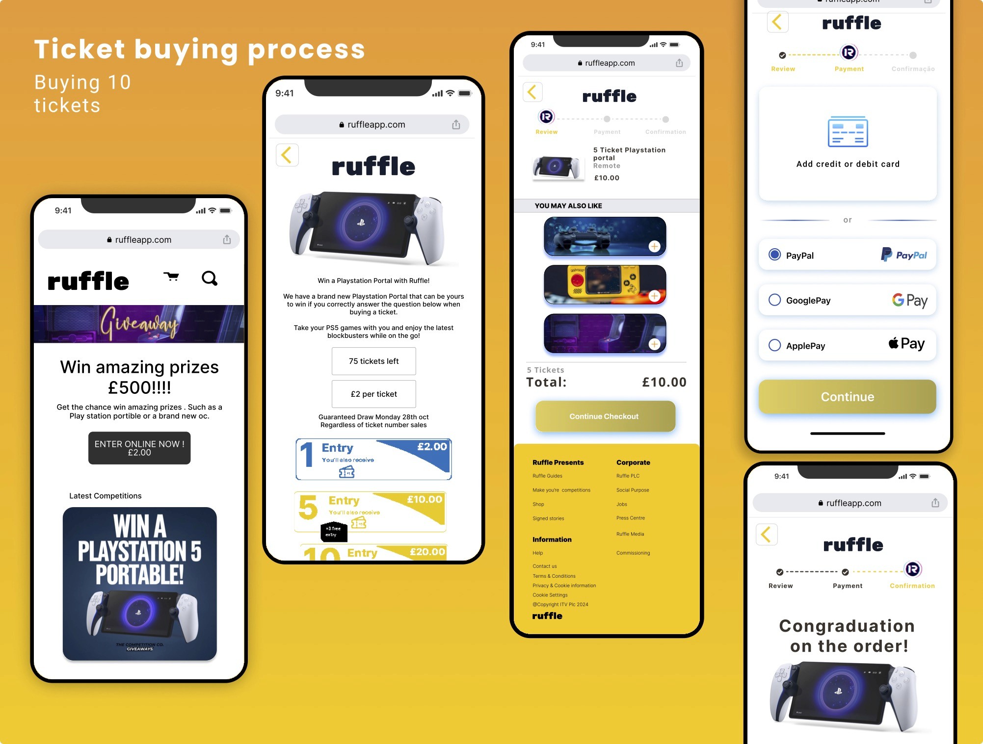
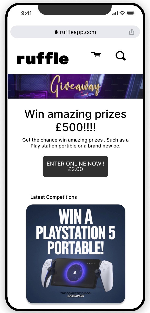
The home Screen will have all of the competitions that we offer scrolling down the page. It will also have a notifcation and sign in option on the Local nav,
Home screen tabs will include
sign-in
register
Terms & conditions
Create your own competition.

The second page will contain visual image of the prize as well as the information terms of the spec and any other information the user will need. How long the prize is open for, how many tickets have been bought.
Page two will include
Sign-in
Register
Terms & conditions
ticket options
terms & conditions
extra ticket options.

This page will be the checkout page.
Where you will have all of the pay options.
There will be a continue button at the bottom of the page but this will be in gray.
apple pay
Goole pay
Pay pal
pay by bank

Infinity Diagram
We reviewed all the research gathered and created an affinity diagram to organise key insights. This visual representation of our findings will guide our analysis and inform design decisions in the later stages of the UX process

The general interation
Infinity Diagram
We reviewed all the research gathered and created an affinity diagram to organise key insights. This visual representation of our findings will guide
our analysis and informed design decisions in the later stages of the UX process
For the Ruffle project, I carefully designed the booking process and add-on screens, ensuring an optimal user experience by focusing on every detail. Using a comprehensive customer journey map, I pinpointed key pain points and challenges, enabling me to streamline and refine the flow with clarity and purpose. This user-centered approach ensured intuitive, seamless interactions that align perfectly with the needs and expectations of our users.
High Fidelity

The home Screen will have all of the competitions that we offer scrolling down the page. It will also have a notifcation and sign in option on the Local nav,
Home screen tabs will include
sign-in
register
Terms & conditions
Create your own competition.
The second page will contain visual image of the prize as well as the information terms of the spec and any other information the user will need. How long the prize is open for, how many tickets have been bought.
Page two will include
ticket options
terms & conditions
extra ticket options.
Terms & conditions
Sign-in
Register
This page will be the checkout page.
Where you will have all of the pay options.
There will be a continue button at the bottom of the page but this will be in gray.
apple pay
Goole pay
Pay pal
pay by bank
High Fidelity
Infinity Diagram
The general interation
We reviewed all the research gathered and created an affinity diagram to organise key insights. This visual representation of our findings will guide our analysis and inform design decisions in the later stages of the UX process

View Example
Feed back

What I would do Differently
Given the opportunity to revisit this project, I would enhance the research process by incorporating insights from multiple participants to ensure a broader perspective. Additionally, I would refine the user journey map by adding more granular details to better capture the nuances of the user experience."
Feedback
High Fidelity prototype
Coming soon
The home Screen will have all of the competitions that we offer scrolling down the page. It will also have a notifcation and sign in option on the Local nav,
Home screen tabs will include
sign-in
register
Terms & conditions
Create your own competition.
The second page will contain visual image of the prize as well as the information terms of the spec and any other information the user will need. How long the prize is open for, how many tickets have been bought.
Page two will include
Sign-in
Register
Terms & conditions
ticket options
terms & conditions
extra ticket options.
This page will be the checkout page.
Where you will have all of the pay options.
There will be a continue button at the bottom of the page but this will be in gray.
apple pay
Goole pay
Pay pal
pay by bank
video example

What I would do
differently
Given the opportunity to revisit this project, I would
enhance the research process
by incorporating
insights from multiple participants to
ensure a broader perspective. Additionally, I
would refine the user
journey map by adding more
granular details to better capture the
nuances of the user experience.