Design tools

Figma, Miro Usability Hub Google docs

Date

February

Role

UX Designer

Duration


4 months


/

customneon

Making the purchase process enjoyable again.

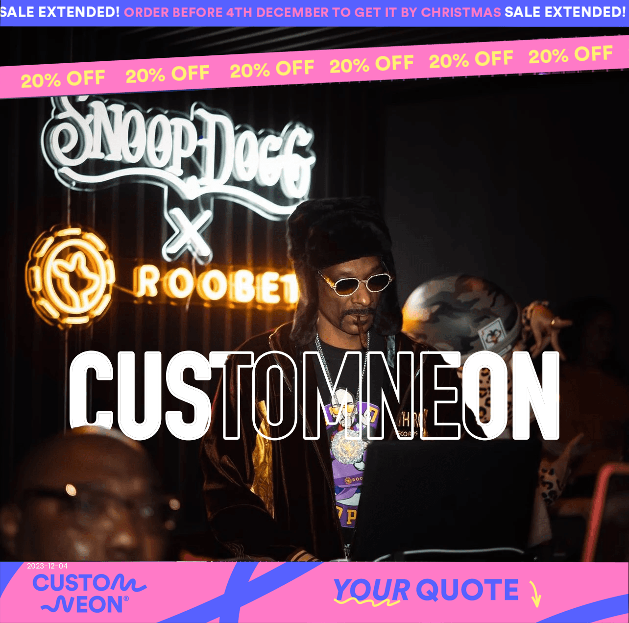
As a neon designer, I specialise in creating custom neon signs that deliver clear messages, evoke emotions, and grab attention. With a strong eye for design, colour, and typography, I blend these elements with the unique appeal of neon to produce striking, memorable creations. Beyond designing, I ensure a smooth purchase process for my clients, guiding them through every step and meeting their specific needs. I collaborate closely with businesses and individuals to understand their brand and goals, transforming their vision into neon designs that align perfectly with their identity.

Design tools

Figma, Miro Usability Hub Google docs

Date

February

Role

UX Designer

Duration

4 months


Introduction

The main challenge as a neon designer was creating stunning, detailed designs while staying within the customer’s budget.

Research

I conducted in-depth usability tests with 3 users, guiding them through key booking tasks to uncover goals, behaviours, and pain points. The analysis revealed that the add-ons section was a major source of frustration, with 75% of users finding it confusing or unnecessary. Additionally, the overall booking flow presented opportunities to streamline navigation and improve usability across platforms.


Pain points

User quotes: fred

While reviewing the add-on page, the user chose to book their friend as an additional driver. “ its not that transparent. Could just say extra driver instead of optional extras"

While reviewing the add-on page, the user chose to book their friend as an additional driver. “ its not that transparent. Could just say extra driver instead of optional extras"

User quote: Jack

user was Still on the add on page and was describing loss damage waver

User knew what the answer was but couldn't explain it in great detail. 

I know what it is but I can tell you off hand.

user was Still on the add on page and was describing loss damage waver

User knew what the answer was but couldn't explain it in great detail. 

I know what it is but I can tell you off hand.

User quote: Tina

User was asked about the lost damage waver

Did not know what it meant.

God! I have no idea what that means!

User was asked about the lost damage waver

Did not know what it meant.

God! I have no idea what that means!

Let's investigate

We reviewed all the research gathered and created an affinity diagram to organize key insights. This visual representation of our findings will guide our analysis and inform design decisions in the later stages of the UX process.

Based on the user journey map, it was evident that there was a consistently negative perception of the add-ons section. Initially, I hadn’t planned to focus on this area, but insights from various research methods highlighted it as a key issue worth addressing

Based on the user journey map, it was evident that there was a consistently negative perception of the add-ons section. Initially, I hadn’t planned to focus on this area, but insights from various research methods highlighted it as a key issue worth addressing

Based on the user journey map, it was evident that there was a consistently negative perception of the add-ons section. Initially, I hadn’t planned to focus on this area, but insights from various research methods highlighted it as a key issue worth addressing

The Goal

make add-ons clear

The main Goal was make this page easy to understand and clear to the user. So they know all of the options.!

Feel in control

Make users feel in control and have more fun with this part of the process!

Enjoy the process

Make the process enjoyable for the user and less stressful.

The flow & Sketching the user journey

Building on the customer journey map from the previous project, I designed a high-level booking flow that aligned with the 'ideal' or 'happy' path for users. Guided by user feedback, I sketched initial wireframes to reduce cognitive load by breaking the booking process into clear, manageable steps. This approach allowed me to identify critical pain points, refine the flow with purpose, and create an intuitive, user-centred experience that met user needs and expectations.

Building on the customer journey map from the previous project, I designed a high-level booking flow that aligned with the 'ideal' or 'happy' path for users. Guided by user feedback, I sketched initial wireframes to reduce cognitive load by breaking the booking process into clear, manageable steps. This approach allowed me to identify critical pain points, refine the flow with purpose, and create an intuitive, user-centred experience that met user needs and expectations.

1 minute video of the first protoype

Feedback

Feedback

Your car rental prototype has a clear and linear flow, which is great for testing the high-level interactions, layout, and overall user experience. The call-to-action buttons are well-designed and effectively guide users through the booking process. I also appreciate the inclusion of the auto-fill feature—it’s a nice touch that enhances usability. over all there were to many steps for the user and the add on section was quite clunky. Additionally, the calendar functionality needs attention. While you can navigate between months, the dates don’t update according to the selected month, which can be confusing. Improving this interaction will make the calendar more intuitive.

Your car rental prototype has a clear and linear flow, which is great for testing the high-level interactions, layout, and overall user experience. The call-to-action buttons are well-designed and effectively guide users through the booking process. I also appreciate the inclusion of the auto-fill feature—it’s a nice touch that enhances usability. over all there were to many steps for the user and the add on section was quite clunky. Additionally, the calendar functionality needs attention. While you can navigate between months, the dates don’t update according to the selected month, which can be confusing. Improving this interaction will make the calendar more intuitive.

Add on section second attempt

The reviews

Thanks to the exceptional service and extra effort I put in, the customer was kind enough to leave a positive review of my work.

Design tools

Figma, Miro Usability Hub Google docs

Date

February

Role

UX Designer

Duration


4 months